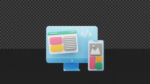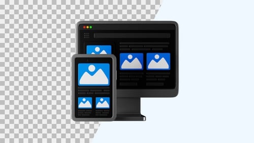
Animated Responsive Technology Devices Icon
By GraphiqaOne great value subscription from €14.50/month
- Unlimited downloads of 27+ million creative assets
- AI Tools: video, image and more
- Lifetime commercial license
- Easy cancellation
Attributes
- Length
- 0:06
- Resolution
- 3840 x 2160
- File Size
- 222 MB
- Frame Rate
- 29.97 fps
- Alpha Channel
- Yes
- Looped
- Yes
- Video Encoding
- ProRes
- Orientation
- Horizontal
- Commercial License
- Further Information
Description
This vibrant animated clip showcases the concept of responsive design, featuring a desktop monitor alongside two smartphones, all displaying user interface elements and profile icons. The devices are outlined with bold black lines and filled with bright, contrasting colors like purple, yellow, and pink, creating a playful and modern aesthetic. Subtle animations, including gentle wobbling and sparkling accents, bring the illustration to life, emphasizing connectivity and adaptability across various screen sizes. This engaging visual effect is perfect for enhancing presentations, explainer videos, and digital marketing materials focused on technology, web development, user experience, and multi-device compatibility, delivering a clear and friendly message about seamless digital interaction.