Responsive Website Theme Showcase for Multi-Device Presentation
By gfxmotionOne great value subscription from €14.50/month
- Unlimited downloads of 27+ million creative assets
- AI Tools: video, image and more
- Lifetime commercial license
- Easy cancellation
Attributes
- Length
- 0:10
- Resolution
- 1920 x 1080
- File Size
- 82.9 MB
- Application Supported
- After Effects
- Required Plugin
- None required
- After Effects Versions
- CS6, CS5.5, CS5, CS4
- Commercial License
- Further Information
Description
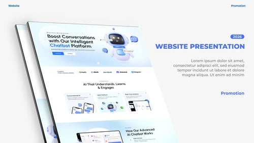
This motion graphics template offers a clean and professional way to present responsive website themes across various digital devices. Featuring animated mockups of a desktop monitor, tablet, and smartphone, the template effectively showcases how a website adapts to different screen sizes. Dynamic text labels highlight key features such as an advanced admin panel, numerous shortcodes, content builder modules, and e-commerce plugin support. Ideal for web developers, digital agencies, or businesses looking to demonstrate the versatility and functionality of their responsive web designs or digital products.


.jpg?w=500&cf_fit=cover&q=85&format=auto&s=6f3abbc20043c624ce0813cd32ef4faa9bec37962ae412288b88cc591f4c4736)